Excel here

Tuesday, September 26, 2006

Kicka$$ In-Cell Graphs: No 1

Eversince I discovered about Incell graphs in Juice Analytics sometime back, I was itching to use them and develop something fun, intuitive and easy. Work kept me buys for most of the last week, so I couldnt come up with something unique and simple till late yesterday. So here is something that I have come up with.

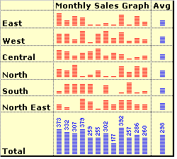
Using In-cell graphs to depict micro charts:

  1. Learn how to create In-cell graphs at Juice Analytics. [Download Excel In-cell Graph Ideas from Juice Analytics]Its simple. If you have a monthly sales figure or someother number then you can convert it into incell graph using Rept() function. For example:
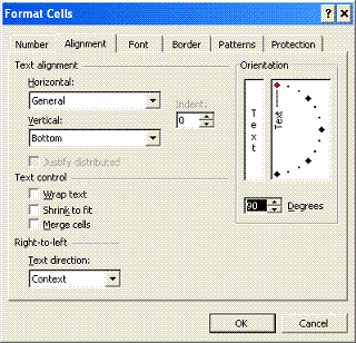
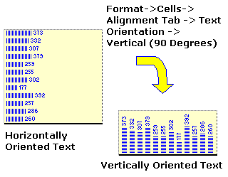
    Rept("#", 20) would result in ####################
  2. But Incell graphs are by default horizontal. Well, thats where you use text orientation feature of Excel. Goto Format->Cells->Alignment Tab. Change the orientation for the cells to 90 Degrees like shown here. You can display incell charts vertically now.

  3. Essentially what you need to do to get something similar to the topmost figure is:
    --- Create Rept("|", monthly_sales_value OR something_else)
    --- Concatenate the results in to one cell along with Carriage return between each value (Quick tip on howto: "a" & char(10) & "b" will return the formula result in 2 lines; that is if you enable wrap text)
    --- Format the text to orient vertically

  4. Playing with In-cell graphs: You can concatenate total values on the top of each graph, you can show average sales, max sales, min sales in seperate columns or together with "AVG", "MIN", "MAX" added in the end of the bar. If bars are too lengthy / small, you can divide or multiple with a constant. So on... [Download Excel In-cell Graph Ideas from Juice Analytics]

Remember: If you dont enable "Wrap Text" you wont get the desired effect.

Type: Tutorial, Graphs, Visualization, Data Representation
Applicability: To get that extra WOW effect, raise a few eye brows in conference rooms, Printed reports, Where data is more and graphs become useless
Excel Knowledge Required: Low to Medium
Ease of Implementation: Simple

Friday, September 15, 2006

Using Web Queries to Import Data to Excel

The other day, I bumped upon this powerful and really simple tool in excel. I must say, its one of those gems that is kept inside excel. I felt like a kid getting excited discovering a candy in his pant pockets. Well, to the point now!

Often, business data and analytics deal with lots of Ctrl+C, Ctrl+Vs. For example you might be downloading a financial statement from Google Finance or a rating for a select list of companies form Fitch! or AM Best or even simple top 250 movies list from IMDB. What we generally do is open the web page and copy/paste the data on to our excel sheets. In the end when we perform the analysis and conclude something, it is always "as of some past date". Well, with the help of Web Queries, the analytics can be real time, well, almost.

5 Steps to using Web Queries to Import Data to Excel Sheets:

  1. First up, locate [Just locate, you need not load that page in excel] the site / webpage you want the data to be copied from. Remember, this should be on public domain without login access. Simply put, if you type the URL in the browser, the page should load, no matter whether you are logged in to that site or not. (Ex: IMDB Top 250 Movies)
  2. Open Excel. Go to Data -> Import External Data -> New Web Query

  3. In the Dailog box for webquery enter the URL you want and say 'Go'.

    Select the table you want like this. The table outline would turn 'Green' or something differant. Click on it and you would see the mark becoming like a tick like this.
  4. Say Import. In the next dailog enter the starting cell. You can click on the properties to change the behaviour of webimport, but it may not be necessary. While the import is going on you see a cyan colored globe trotting around itself on the status bar. If you cant, blame your office vendor.
  5. Once the table is loaded, you can right click anywhere on it and say Refresh Data! and it would fetch the new data from web automatically.

Potential Applications of Web Queries Data Import Tool:

  • Automated Portfolio Managers: Enable automatic refresh on File open and load MF, Share price related data from public sources.
  • Realtime graphs, Charts and dash boards: You might have some application running on your LAN and generating data. Now assume there is a way to convert such data into HTML on the fly. Bingo! you dont have to copy paste the data to excel now. Just link up once and you are done.
  • So many more, I think of almost anything and I see a possibility of using Web Query Imports to simplify that task.

Friday, September 08, 2006

Teaser for the weekend: How to get Graphs on Maps in Excel

[Click on the image for a bigger version]

Often business data goes hand in hand with geographical data. Thanks to tools like Google Maps and several associated mash-ups. But often it might be required to show data on a map to create an effect or draw some conclusions.

An example: Lets say you are analyzing annual sales in various States of US. Now usual ways of doing it include tables, bar/pie charts etc. But much more intuitive way would be to use an US outline map with bubbles in each state with their sizes representing segment/product-wise sales.

I had to do a similar analysis sometime back. And I did it in our dear excel itself without much pain (well, it is not so straightforward, but pretty much do-able)

So, here is a teaser for all the R1C1 readers. Try to findout the way for getting the following above graph in excel. No macros used (although, some amount of manual labour was!) The 3 colored bubbles represent 3 different segment/product figures (be it sales, profits, employees or anything you like).

Leave a comment with outline solution if you have one, Or wait till next week to find a simple enough way to do this.


Type: Teasers, Graphs, Data Analytics, Data Representation, Visualization
Applicability: for situations with both {sales, profits, people} and geographical data
Excel Knowledge Required: Moderate to Advanced
Ease of Implementation: Medium


PS: from this post onwards, I will be including the above format table with every post. To make the usage of R1C1 better.

Tuesday, September 05, 2006

3 Steps to Create cool dashboards in excel

Dashboards are very common business monitoring tools, but creating them in excel with all the bells and whistles is not so easy. So here is a quick 1-2-3 on how to do it.

Lets take a sample of 2 consecutive year sales figures for 7 regions. The colums have Region name, 2004-05, 2005-06 figures and finally YoY Growth percentages. The lame dashboard should look something like this:


But may be we can make it little better. Ideally, a person looking at this would like (to know) the following things:


  • What are the things that are going up / down / remaining constant
  • The chart should look simple and not cluttered; meaning, there cant be multiple columns to present information. He/she should be able to look at one column and concluded something
  • May be little graphics wont hurt the presentation while retaining the information.

So, a cool dashboard would look something like the below one:

Well, how to get it in 3 steps?

  1. Type the following formula in the cell F5 and drag it to apply to all the cells

    [Click on the image to see bigger version of the formula]
  2. Select the range F5:F11, goto Format->Conditional Formatting and enter the following values there:

    [Click on the image to see bigger version of the formula]
  3. Finally, if its already not, change the font of the worksheet to Arial, (see those arrow marks, they are not available in all fonts. And btw, if you dont know how to insert them in the formula use Start->Programs->Accessories->System Tools->Character Map and then locate the symbols.)

So, go ahead and impress everyone with the cool dashboards.

Monday, September 04, 2006

How to Get Unique Items using Excel

I recently had to perform some analysis on a set of insurance companies in certain geography. After searching the net I found such list of companies operating in that continent. But the problem is,

  • These companies are listed multiple times, one time for each of their geographical area of operation.
  • I cannot count each company only once since there is geography specific operational data in that list.
  • But at the same time, information pertaining to organization like total sales, strategy etc. are common to all the subsidiaries / separate entities of a company.
  • There are too many companies to do the manual grouping of companies

I think this type of problems are fairly common in business analytics. So here is a relatively simple solution for getting unique list of companies without losing any information or writing macros. See the example for yourself.

Lets take an example of employee data. You have fields like Person Name (sometimes unique), Previous employment, Previous workplace, Previous Salary. Now, if person Anand worked in more than one place earlier, there will be more than one rows with his name. But for details like DOB, SSN etc. there wont be multiple rows. So you need to know how many uniques rows are there in that huge list. Detailed Steps:

  1. Enter / copy the data

  2. Sort the list on person name

  3. In the column next to prev-company enter the following formula in E2
    =IF(OR(LEFT(B2,SEARCH(" ",B2))=LEFT(B3,SEARCH(" ",B3)),LEFT(B2,SEARCH(" ",B2))=LEFT(B1,SEARCH(" ",B1))),LEFT(B2,SEARCH(" ",B2)),B2)

    Copy - paste the formula in all the cells in the list for the column. You will see the followin result.

  4. Now create one more column next to Unique Name with heading Unique?. Paste the following formula in the F2. Apply the formula to all the cells in the list.

    =IF(E2=E3,0,1)

    Now, you would see the list like this.


  5. Now sellect the top row and apply "auto filters" [Data->Filter->Auto-Filter] And select 1 in the Unique? column. You will see all the unique names. You can copy paste this list in another sheet/work-book and work with it or assign corresponding codes to each of the unique items in this list.

To summerize:

1. Sort your list first.
2. Get the unique parts like first word / first number etc in another column. In my case I had to use first word.
3. Compare consecutive rows and mark the differences. Now you know how many unique items you have.

Comments / Any better ways of doing this are always welcome.